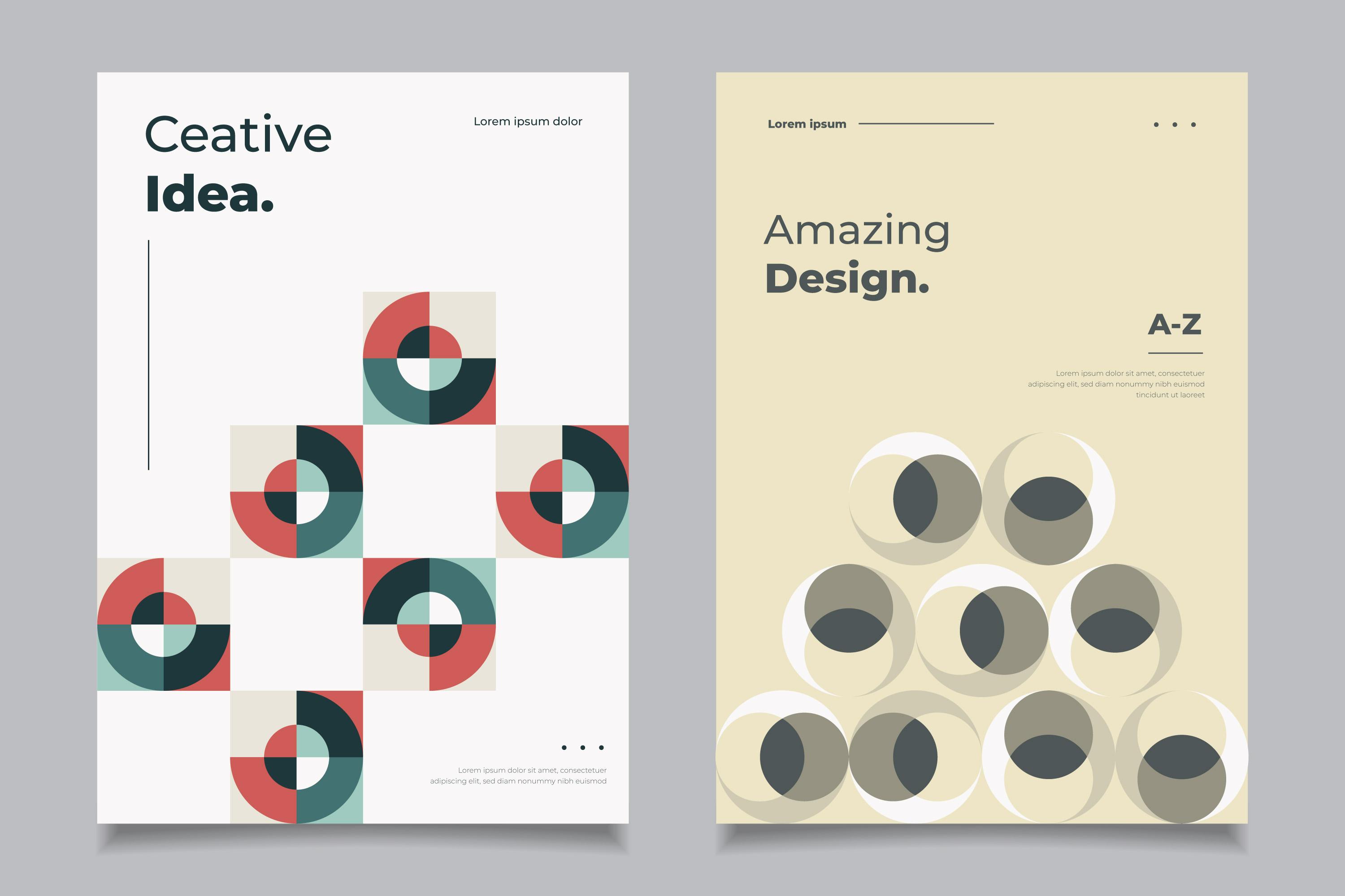
"Create effective and attractive..."

The Importance of Color, Font and Layout in Signage, Branding and Printing
By Jasmine Tauber
Signage, branding and printing are forms of visual communication that aim to convey a message, promote a brand, or persuade an action. They can be seen in various contexts, such as billboards, flyers, posters, banners, brochures, business cards, logos, labels, and packaging. To create effective and attractive signage, branding and printing, you need to pay attention to three key elements: color, font and layout. These elements can influence the readability, aesthetics, and impact of your design, and affect how your audience perceives and responds to your message.
Color is one of the most powerful and expressive elements of design, as it can evoke emotions, create associations, and communicate meanings. Color can also help you establish your brand identity, differentiate your products or services from competitors, and attract attention. However, choosing the right color scheme for your signage, branding and printing requires careful consideration of factors such as your target audience, your message, your industry, and your cultural context. You also need to understand the basic principles of color theory, such as the color wheel, the color harmony, and the color psychology.

Font, or typography, is the art and technique of arranging letters and text in a visually appealing and legible way. Font can also help you convey your tone, voice, and personality, as well as reinforce your brand identity and message. However, choosing the right font for your signage, branding and printing requires careful consideration of factors such as your target audience, your message, your medium, and your design style. You also need to understand the basic principles of typography, such as the font categories, the font anatomy, and the font hierarchy.
Layout, or composition, is the arrangement and organization of visual elements in a design, such as text, images, shapes, and colors. Layout can also help you create a sense of balance, contrast, harmony, and unity, as well as guide your audience's eye movement and attention. However, creating a good layout for your signage, branding and printing requires careful consideration of factors such as your message, your medium, your space, and your design style. You also need to understand the basic principles of layout, such as the grid system, the rule of thirds, and the golden ratio.